E-Commerce checkout process

The challenge:
At the time the existing checkout process was about 5 years old and from the Google Analytics it was evident that about 25% of customers were dropping off in the purchase funnel. It was difficult to purchase anything because there were five stages in the customer checkout process. Plus each of the points in the process had many buttons, links and distractions around the side off the screen. It was also impossible to view on a mobile device, which limited the number of users able to complete the task.
At this point more and more people were converting to browsing e-commerce sites using mobile devices (tablets and phones) rather than desktop machines. By keeping this many stages we were alienating these users, sales online were going to dwindle and it would put pressure on the telephone ordering service.
The approach
By reviewing the customer journey I was able to start again from scratch. I researched Amazon, Boots and Holland and Barrett to see how they compared. I then mapped out the ideal sequence.
- Reducing the number of steps by trimming the unnecessary questions.
- Removing the distractions (links and imagery) around the page
- Make it mobile friendly.
If i could successfully reduce the drop-out rate I could ultimately increasing sales through this purchase sequence.
The final result was a 4% increase in sales and 30% more sales from mobile devices. It also reduced the number of phone calls received by the customer service team from frustrated users who struggled with the old checkout process.
The result
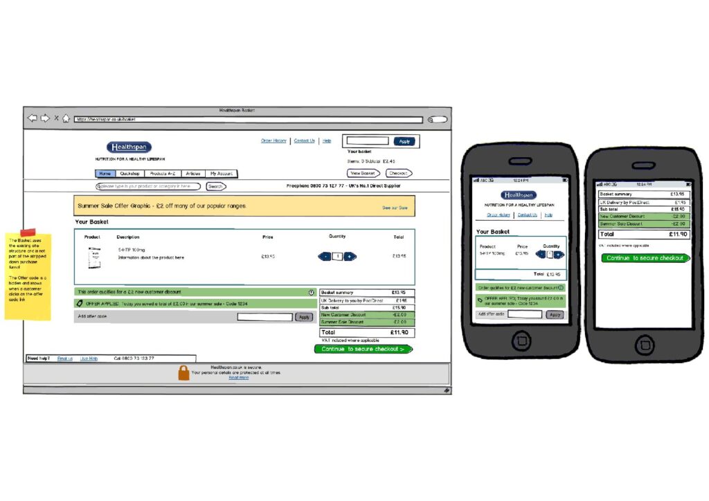
The screens show a selection of the pages from my Balsamiq mockups alongside each screen layout is a mobile layout. The full sequence of pages can be seen here as a pdf.
Project overview
Healthspan
Reviewing the checkout process for Healthspan highlighted customer confusions and enabled a redesign that was user friendly and mobile friendly too