Insurance quote process
The challenge:
Whilst at Confused.com I was asked to look at both the Home and car Insurance and quote process and work out ways to improve the number of users that completed it. These online forms are critical to the way the company makes money.
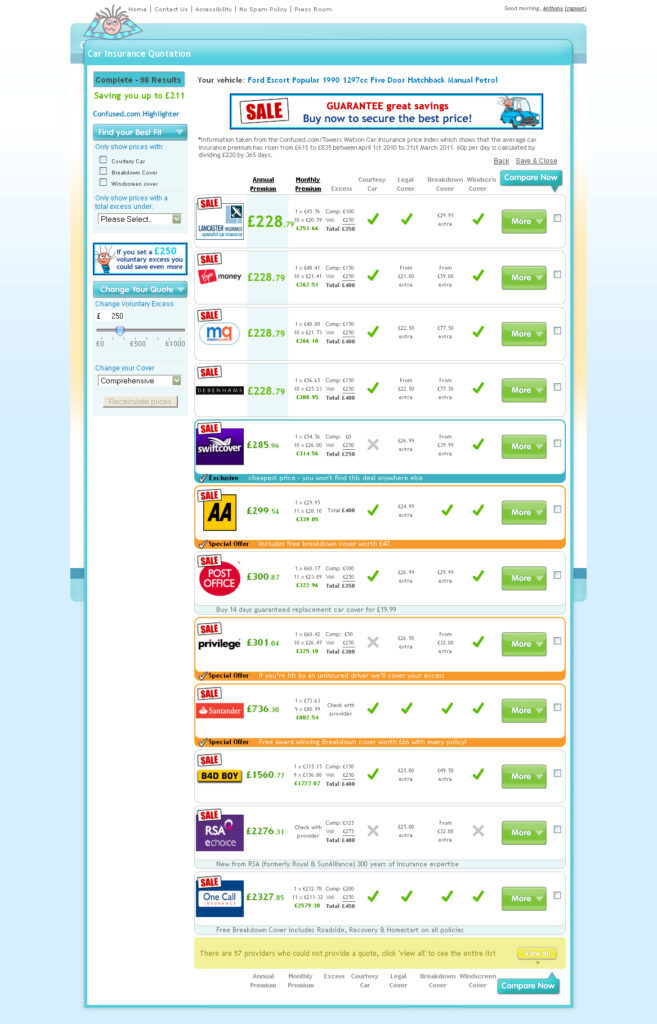
Part of this work was to review the results page and consider ideas to help increase the click throughs to purchasing a policy. There was a large amount of resistance from product managers that any changes could result in a reduction of people purchasing and in turn a loss of revenue. Therefore any changes to the page would have to be approved and rigorously tested before any changes were put live.
Research
The first part of the task was to identify the key areas of the page and work with users to establish what was important to them in choosing a policy. Confused.com have a number of key customers who are happy to talk through their experience with using the site. Initial research was conducted by inviting these users into the Cardiff office to talk through the quote process and any issues they had.
This initial feedback quickly identified price, insurer name, hidden extras and any discounts.
Designs were mocked up and reviewed by the management team before testing was approved on 1% of live traffic. This 1% was split using Google Analytics and gradually increased to 5%, 10%, 35% and finally 50% of traffic as the designs proved more successful than the original.
Button names, font sizes order of information were amongst the things tweaked in the designs and tested. This was a very slow methodical process but the results were surprising. Customers wanted to see less results not a page of options to choose from. They were massively influenced by Brand picking a company they had heard of above a cheaper price. They were keen on seeing if windscreen cover was included. They wanted just the headlines with the details hidden behind a ‘find out more’ link.
User testing
The first part of the task was to identify the key areas of the page and work with users to establish what was important to them in choosing a policy. This was undertaken by an external agency BunnyFoot. Working with them we were able to record user sessions with a mixture of users and non users of the service. The research quickly identified price, insurer name, hidden extras and any discounts.
The approach
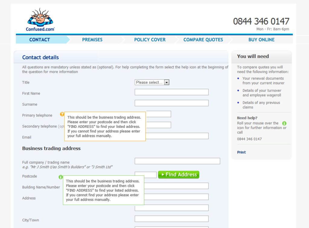
This involved breaking the forms question set down into clear defined areas and ensuring the customer knew where they were within this process. The first steps were identifying which questions where necessary to provide an accurate quote and removing the ones which were not needed.
It also involved experimenting with the order in which questions were asked. With a view to asking easy ones first to get users into the process quickly without having to make them think too much. The more taxing questions would appear further down the order.
Results
The result is the final iteration which resulted in a 4% rise in conversions. This may sound a small amount but to Confused.com that was tens of thousands of pounds.
Take a look at the homepage redesign i worked on at Confused.com
Project overview
Confused.com
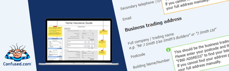
Confused.com quote process, the questions and the results page displaying quotes