Designing a fuel price comparison tool that shows the real cost of a fill-up
Fuel prices can vary from one forecourt to another. I designed Fuel Nearby, a UK fuel price comparison tool, to help drivers find local petrol stations, compare prices on a map and judge whether a cheaper pump is worth the drive.
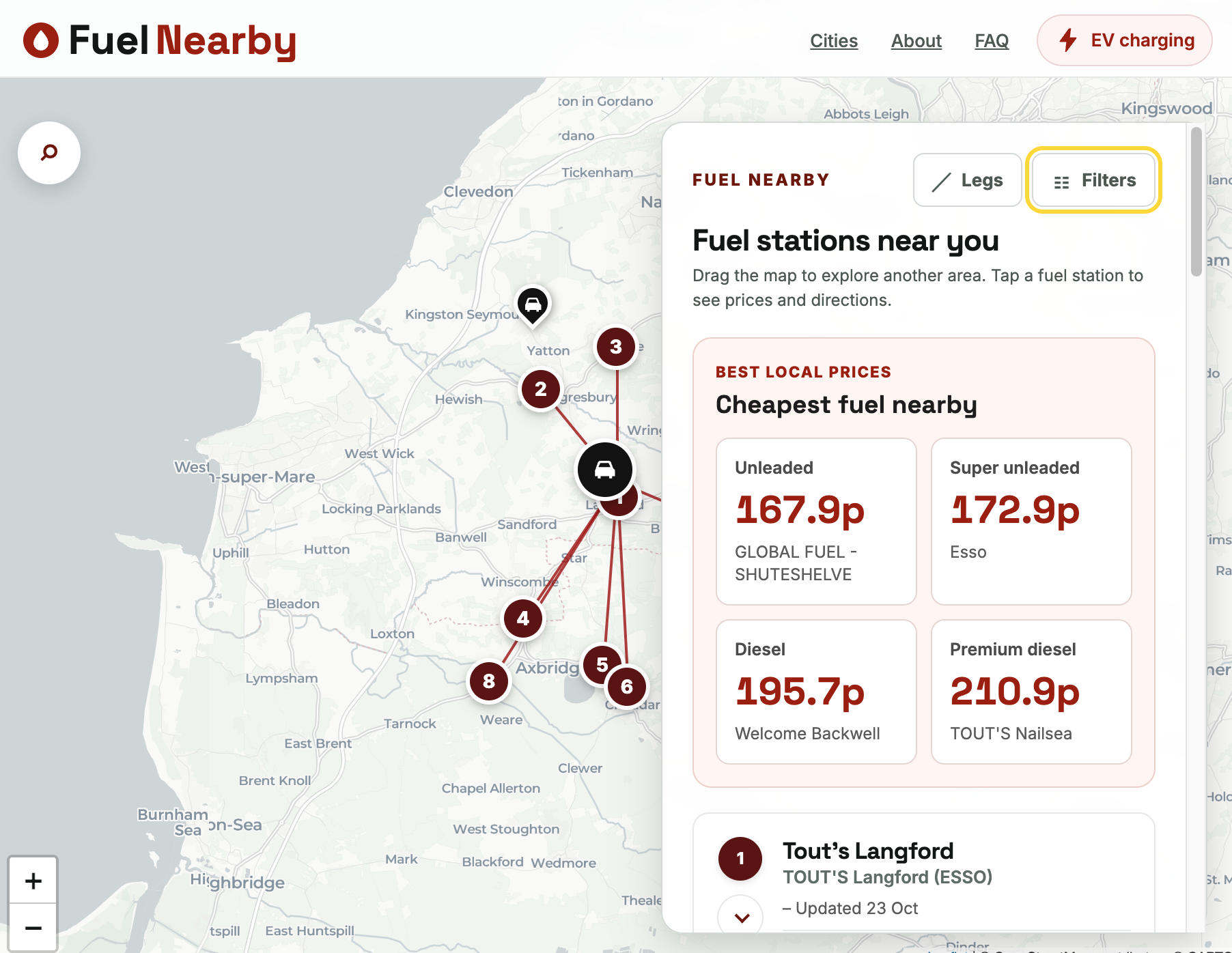
Designing a clear fuel price map
After building Watt’s Nearby, I wanted to bring petrol station locations and prices together in one easy-to-scan map. Fuel Nearby uses the UK government’s Fuel Finder data, prepared through a server-side PHP endpoint.
Built with Leaflet and CARTO tiles, the map pairs station markers with result cards so drivers can see where a forecourt is and compare its prices. Filters for fuel type and brand make it easier to focus on relevant stations.
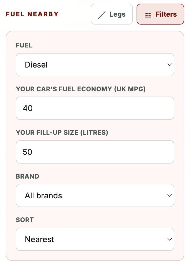
Does a cheaper station save money after the drive?
A lower pump price does not always mean a cheaper fill-up. Fuel Nearby estimates the drive cost using the distance to each station and average fuel economy, then compares it with the potential saving for a tank of fuel. This helps drivers see whether the trip is likely to save money or cost more.
Making fuel prices easier to compare
Fuel Nearby builds on what I learned making Watt’s Nearby. The design challenge was turning changing fuel-price data into a useful comparison: show nearby options clearly, make filters easy to use, and include the cost of getting there. It’s a free tool for finding local stations and deciding where to fill up.