Muddy Boots Software — UX Design Case Study
This web design case study outlines my work at Muddy Boots. As the first inhouse UX designer, I helped shape the accessibility of the product and built a design system to ensure all the applications looked consistant.
Challenge 1 - Quality control dashboard
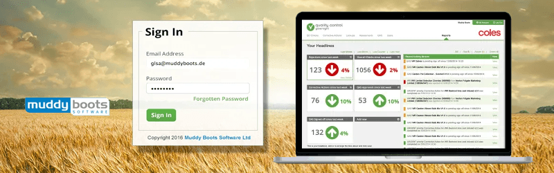
Muddy Boots Quality Control software is a web and mobile-based tool used by Supermarkets, suppliers and manufacturers to schedule and manage product quality.The products previous homepage was a list of assessments available to the user. These reports illustrate the quality of the supply chain and identify problem areas. However the list interface is not very welcoming, the initial screens do not help to ease the user into the product offerings.
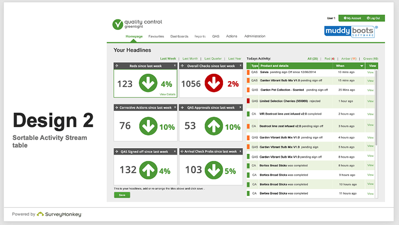
I devised a method of consulting with users on what they wanted on a homepage and discussed initial ideas with them face to face rather than second guessing. After consulting with users I found that they often access the same report to find the latest figures before copying and pasting into a spreadsheet to create a graph.
These evolved as the product grew. From simple introduction screens to useful dashboards that gave an all-up view of changes since the previous login.
The process involved observing usage habits either through analytics and shadowing users at their own place of work. Then prioritising the useful and frequently used activities onto a start up screen.
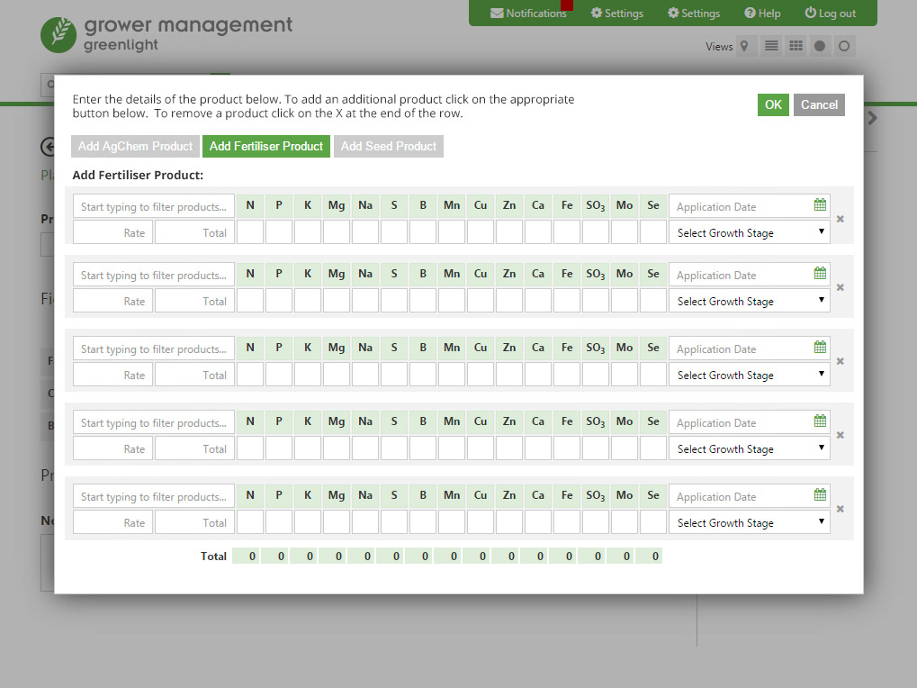
Challenge 2 - Crop managament tool
Greenlight Grower Management is an online crop management system from Muddy Boots. It enables field recording and crop data to be stored on the Cloud allowing farmer to share with agronomists and contractors.
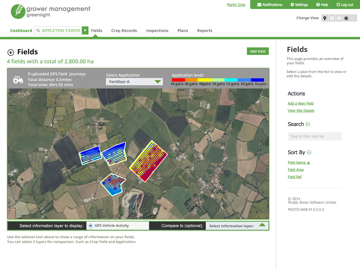
A big feature of this software is mapping fields. Current users would simply name their or even describing their fields which is not helpful.
There was an idea raised that farmers or agronomists could add photos or even GPS co-ordinates. This proved inaccurate or time consuming. Instead i had the idea to use Google Maps in order to overlay the current location of the user and hopefully illustrate a clearer field boundary.
These screens illustrate ideas for how the product could work using Google Earth Satellite views along with other available mapping data overlaid. These screens show how we could illustrate crop growth, soil problems, crop diseases and weather predictions.
This was developed now and is available in the latest product release.
My responsibilities
I was Head of UX Design at MuddyBoots Software for 3 years, I worked on the user interface design for the Product dashboard, email branding and the single sign-on pages. During this period I was often asked to help on product steering groups.
- User interface design for all applications
- Organising user testing sessions and report recommendations for improvements
- Aligning with product owners to identify key commonalities for the applications
- Creating photoshop mock ups, wireframes and interactive prototype
- Cross functional collaboration and creative direction
- Coordinating with product owners to understand high level objectives and collaborate with engineering teams to translate them into engaging user experiences
Online styleguide
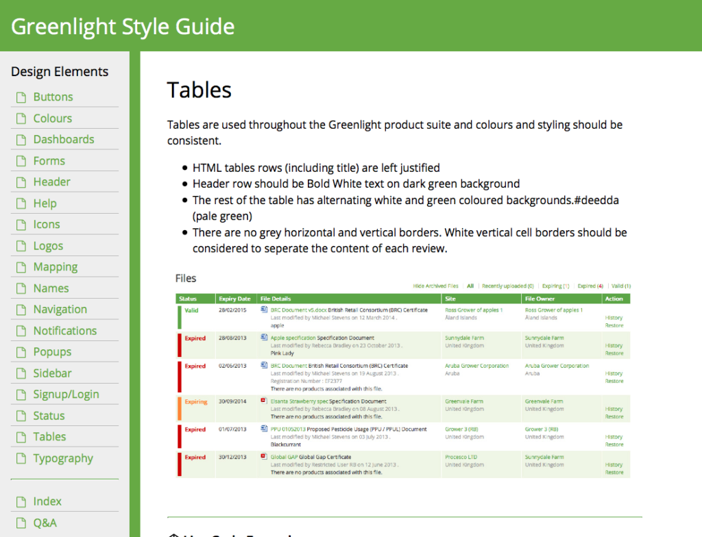
I was responsible for the user interface design for the company's suite of products. Each product needed a similar look and feel but the individual teams designed what they thought looked best. Creating the style guide online with code snippets ensured members of the separate teams were using the same design, style sheets and html. This kept the look consistent across all the products.I regularly ran meetings with the stakeholders to review product changes and ensure that the latest style guidelines were being adhered to. This is a constant cycle ensuring that the guide develops as more product features are created.
Below shows a selection of screenshots from the initial prototype that captures a submission date and displays the difference or time period with todays date.

About the designer
Martin Gray is a UK-based web and interaction designer specialising in accessible GOV.UK services and complex digital platforms. Explore more web design case studies or learn more about Martin Gray.