My role
As the lead designer, I maintained and refined the style guide, ensured consistent branding, redeveloped the quote process, and supported marketing campaigns and digital initiatives for the website and social channels.
- Led homepage redesign and branding during company rebrand
- Produced web marketing banners and social media content
The UX challenge
Redesigning the Confused.com homepage required balancing multiple stakeholder priorities, iterative user testing, and careful A/B testing to optimise the conversion funnel without negatively impacting revenue. The project spanned nine months of design, testing, and optimisation.

User research & discovery
- Stakeholder workshops to align business goals
- Regular Customer Q&A research sessions (Meet the Customer)
- Card sorting to prioritise homepage content
- Behavioural feedback on quote journey friction points
The approach
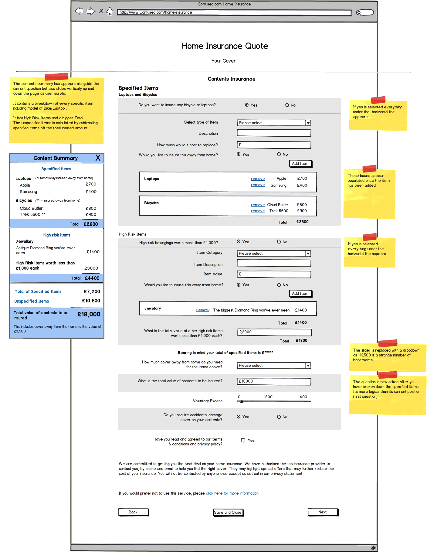
Initial concepts were sketched on post-it notes, refined via card sorting, and iteratively prototyped in Balsamiq before coding in HTML. Live A/B tests were run incrementally (1% → 100% of traffic) to measure improvements in click-through and quote completion rates.
“Meet the Customer” sessions provided crucial user feedback, guiding content hierarchy, visual clarity, and interaction flow.
Results
- +2% increase in click-through rate to car insurance quote
- +4% uplift in conversion through quote journey optimisation
- Improved homepage engagement through iterative A/B testing
Click here to view the final build:

A/B Testing & Conversion Optimisation
Multiple homepage variations were tested against the original, measuring click-through, quote completion, and engagement depth. Incremental traffic allocation ensured safe, data-driven improvements.
FAQ
What UX methods were used?
User research, card sorting, iterative wireframing, and live A/B testing.
What impact did the redesign have?
Improved click-through by 2% and quote journey conversions by 4%, resulting in significant revenue increase.