Hub Homepage testing
The challenge
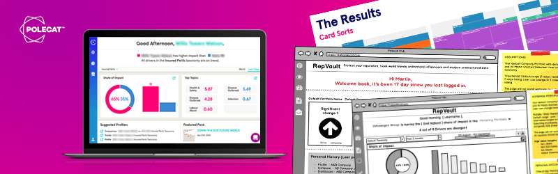
The original concept for the Hub homepage was to simply have a list of products with a welcome message. This was functional but not insightful. I had a belief that the design should contain highlights of the reputation profile or contain links to other product offerings from Polecat. The challenge was to present some initial thoughts and run some user research to test my theory and discover what is useful on the Hub Homepage.
As the Lead UX Designer I was responsible for designing concepts for the homepage, running user testing and presenting ideas back to the Product Owner.
- Designed initial sketch to final design of Product Page.
- Developed UX strategy and measure product usage to qualify success
- Test ideas for a homepage to act as an entrance to the Polecat Hub.
The approach:
The home page provides the user with ‘at a glance’ view of their company’s reputation. However, because each user is different, we used a modified card sorting technique to identify what this means to each individual. Working with a Product Designer and a Data Visualisation Engineer i created a script, a digital user testing layout and conducted interviews with 6 participants.
Participants: Six Polecat employees, chosen for their user-centred roles such as Customer Service Managers.
Time allocated: 45 mins – 1hr
1- Modified card sort: Assembling a set of pre-determined components within a 16×24 grid. This task is designed to capture priorities, trade-offs, and to generally get a feel for what users associate with a high-level reputation view.
2- Devising the insight components: Drawing upon the existing RepVault insights for inspiration, what would you want to see on the homepage?
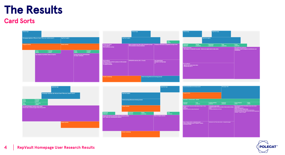
Conclusions:
- No/minimal scrolling: Consistent with the at-a-glance, high-level purpose of the page
- No more than 3 insights: Having a larger number could overcomplicate the user journey
- Share of Impact & ME/MD = high value insights: Should make a concerted effort to include these (or at least cover the need that they fulfil)
- Sentiment = high value metric: Some sentiment analysis would be a welcome addition
- Time as a comparative measure: Time should be used to create context, to give a sense of change / baseline to compare to
- Taxonomy & Date Range selectors: These were the two selectors that came up the most in testing. Focus/Context entities should be clearly communicated, but should be fixed.
Project overview
Polecat Intelligence
Polecat Hub Homepage, Initial Designs and layouts.User Testing process, card sorting, the results and the development of the design.