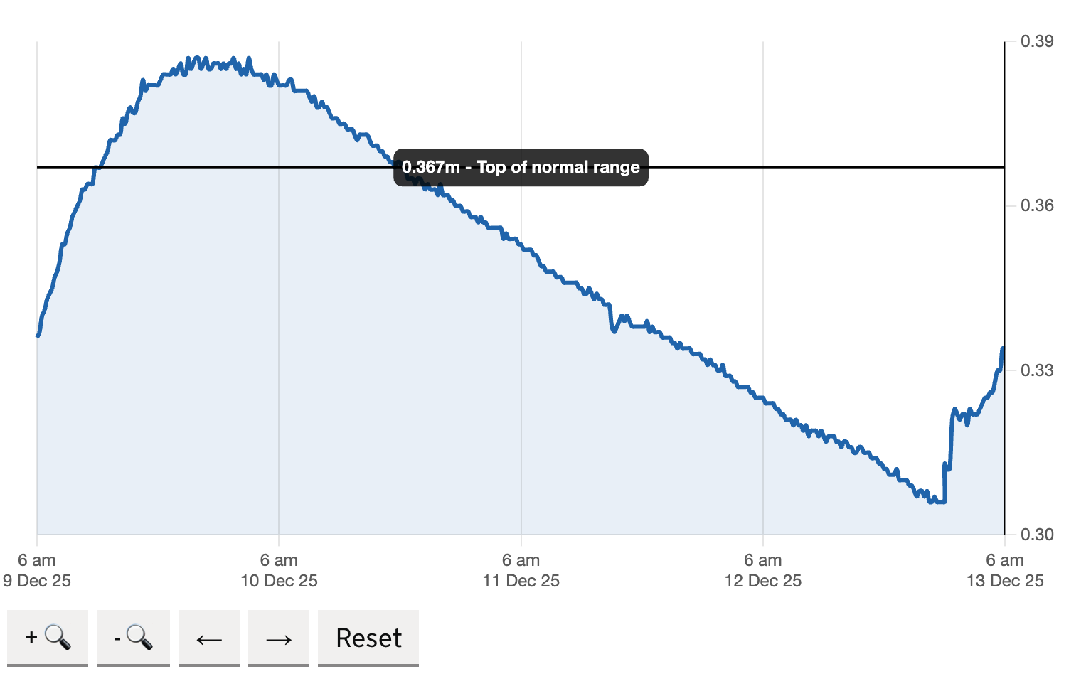
I am currently working with Defra on the check for flooding team. I have been tasked with reviewing their five-day river level charts to add more historical data.
This meant increasing the amount of data we showed on the chart so users could compare the current river levels with the previous week, month or year. To support user research, I needed to create a prototype of the river-level page with an almost identical graph.
Ask AI to help
I asked AI for the best way to recreate the chart and it gave me several options. Chart.js was the easiest to pick up and implement, so I began by installing it and getting it to read data from a separate CSV file. The instructions on the chart.js website were very basic and I was soon able to get a chart that worked within the gov prototype.
However, it needed a lot of work to get it looking like it was part of the gov.uk design library. The colours were wrong, the fonts incorrect and the x and y axis were very cluttered. I started to sift through the stylesheet trying to work out how to add the correct styles for each of the government components.
Then I thought, why not ask AI again. This time I prompted it to make it look like a gov uk chart and gave it some examples for National Statistics Office, and Defra. The results were astonishing, it cleared up the colours, the fonts, the styling of the lines, the y axis labels and the x axis labels. It generated the stylesheet for me and told me to add it to the bottom of my styles.css file. I did, and the chart immediately matched the government design system almost perfectly.
Within just three weeks I had a fully working prototype which did the following things and then tested them with a panel of users.
- Read data dynamically from a separate CSV file supplied by the Environment Agency
- enabled zooming into a peak to view more detail with a dynamic x axis
- allowed panning forward and backward along the timeline to view river water-level patterns
- showed a specific date period using a MOJ date picker tool
- added the top of normal range line to the chart at all times
It was not perfect, and I would not consider the output production-ready code. However, it enabled me to create a prototype with features that allowed users to navigate a dataset and provide feedback on which elements they found useful or difficult. This would not have been possible with a flat, non-interactive chart. I was also able to do this without using any developers time.