Extending DEFRA’s river level forecasts with interactive charts to improve data clarity and usability
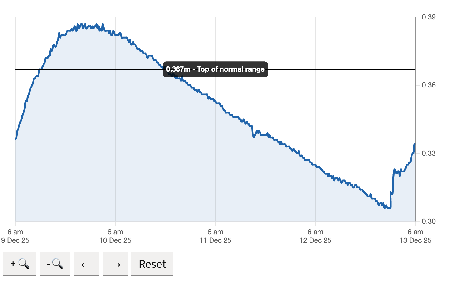
I’m working with DEFRA to evolve the 5-day river level forecast into a more flexible chart that allows users to explore data across longer time periods — including 6 months, 1 year and 3 years.
Impact
- Extended 5 day river level data to include 6 month, 1 year and 3 year views
- Provide clear reference points for current levels, normal ranges and historical highs
- Enabled users to zoom into specific data points for closer inspection
- Improved chart readability by refining axis precision and reducing duplication
- Introduced contextual markers such as current level, normal range and historical highs
- Designed consistent, mobile-friendly controls that prevent layout shift and confusion
What I did
I redesigned the chart across different time ranges. Adjusting data intervals, simplifying interaction patterns with clear zoom, pan and reset behaviours. Formating controls so they only activate when relevant, reducing cognitive load I also explored whether zoom is necessary in the 5 day view, where precision is already high.
I built the chart using Chart.js, extending its core functionality with custom plugins to support the specific interaction and data requirements. This allowed me to control behaviours like zooming, panning, dynamic time ranges and contextual markers (such as current level and historical highs) while keeping the implementation lightweight and performant. I focused on making the prototype as close to production-ready as possible — including responsive behaviour, accessible controls and stable interaction patterns — so it could be tested in realistic conditions. This enabled three rounds of user testing, where feedback directly informed refinements to clarity, interaction and data presentation, before handing over a well-defined, validated solution to developers for build.
Outcomes and impact
The updated chart provides a clearer, more scalable way to explore flood data across multiple time horizons.
- Users can quickly switch between short-term forecasts and long-term trends
- Key information is easier to interpret without specialist knowledge
- Interaction patterns are more consistent and accessible across devices
The result is a clearer, more flexible chart that allows users to move from short-term forecasts to long-term trends and zoom into the detail when they need it.
What I’m focusing on
- Designing for clarity over control: I prioritised clear, consistent interaction patterns that reduce cognitive load, such as zooming only when relevant and providing clear reset options.
- Reducing cognitive load in high-pressure scenarios: I focused on making key information (like current levels and normal ranges) immediately visible, while allowing users to explore more detailed data without confusion.
- Balancing precision with usability in data visualisation: I refined axis precision and data intervals to ensure the chart is readable and informative across different time ranges.
This project continues to refine how data-heavy services can remain simple without losing functionality.
It reinforces the importance of:
- Designing for clarity over control
- Reducing cognitive load in high-pressure scenarios
- Balancing precision with usability in data visualisation


About Martin Gray
Martin is an interaction designer specialising in UX, UI and front-end prototyping. He specialises in accessible GOV.UK services and uses the GOV.UK Prototype Kit. View his web design case studies or learn more about Martin Gray.