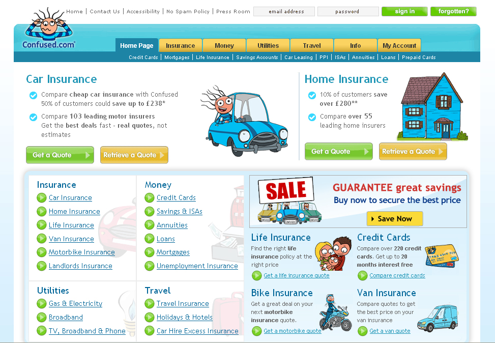
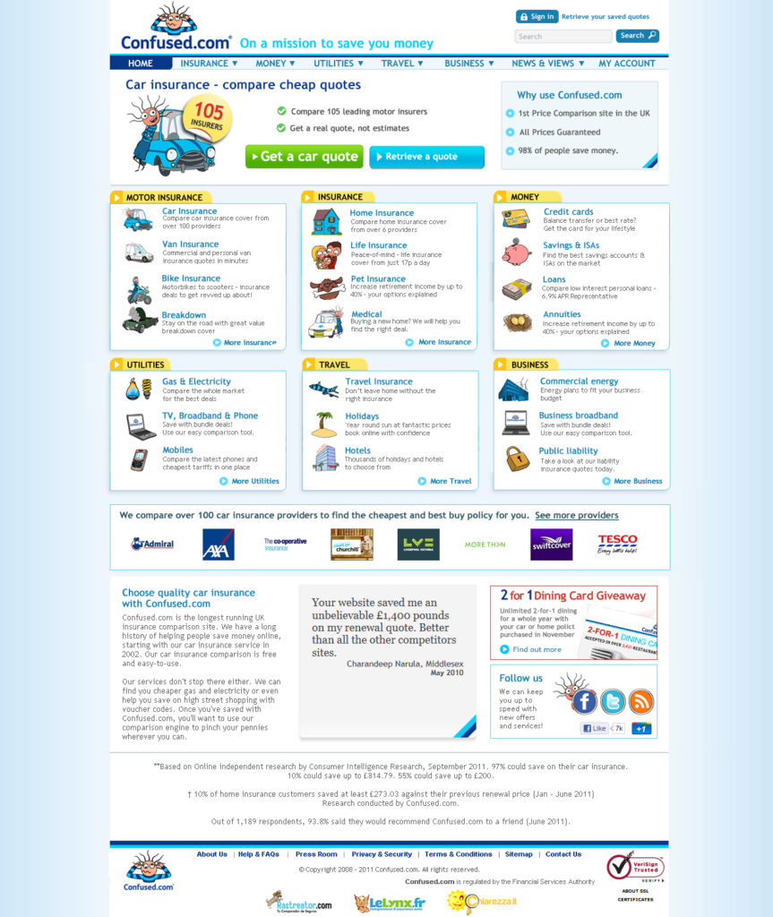
Confused Homepage

My Role:
Heading up the design team at Confused, I was responsible for maintaining and refining the style guide and ensuring the Confused.com branding is consistent across the site and externally. Much of the work included a re-brand, redeveloping the quote process, producing Flash Banners for web marketing campaigns and Social Networking for both Confused.com and the mascot Cara.
- I successfully redesigned the Car insurance quote process, by reducing questions sets and layout improvements resulting in a 4% rise in conversions.
- I support PR team with online and offline promotions. Including all branding for a Confused.com Swap Shop event at Victoria Station hosted by Keith Chegwin.
The Challenge:
The biggest project was the complete redesign of the company homepage (Confused.com). This was a nine month process of design, development ,user testing, refining and optimising.

The process was very iterative. Initial ideas were written on post it notes and displayed on project walls before being refined to a core selection. I then card sorted for priority using a number of key people within the company and a selection of customers which were regularly invited in to work with us.
This sounds bizarre but it was a great idea. Meet the Customer was a monthly question and answer session where we invited users in and rewarded them for their time and feedback on the website and the quote processes.
From these discussions a number of layout combinations were sketched up in Balsamiq and then coded into HTML on the live CMS. Each one was A-B tested alongside the existing homepage using a small percentage of the traffic. Initially just 1%. but this was increased incrementally to 5% 10% 25% up to 100% as each iteration was more successful than the original.
I cannot stress enough how important this page is to Confused. I have seen managers dress up in Sumo suits and wrestle for the chance to add their product to the company homepage. The reason being is that the traffic is enormous and just a 1% reduction in people visiting the page could reduce revenue for the company. Having the opportunity to work on the page and ultimately improve it was a real privilege.
The result was good, the redesign of Confused homepage resulted in a +2% increase in click-throughs to the car insurance quote processes. So everyone was happy.
- Post it notes and Sharpie
- Card Sorting
- Balsamiq
- Photoshop
- HTML
- User Testing
- Rebranding

Project overview
Confused.com
Redesigning the Confused.com homepage was a massive honour and a great challenge. With many stakeholders the design needed to be tested and successful