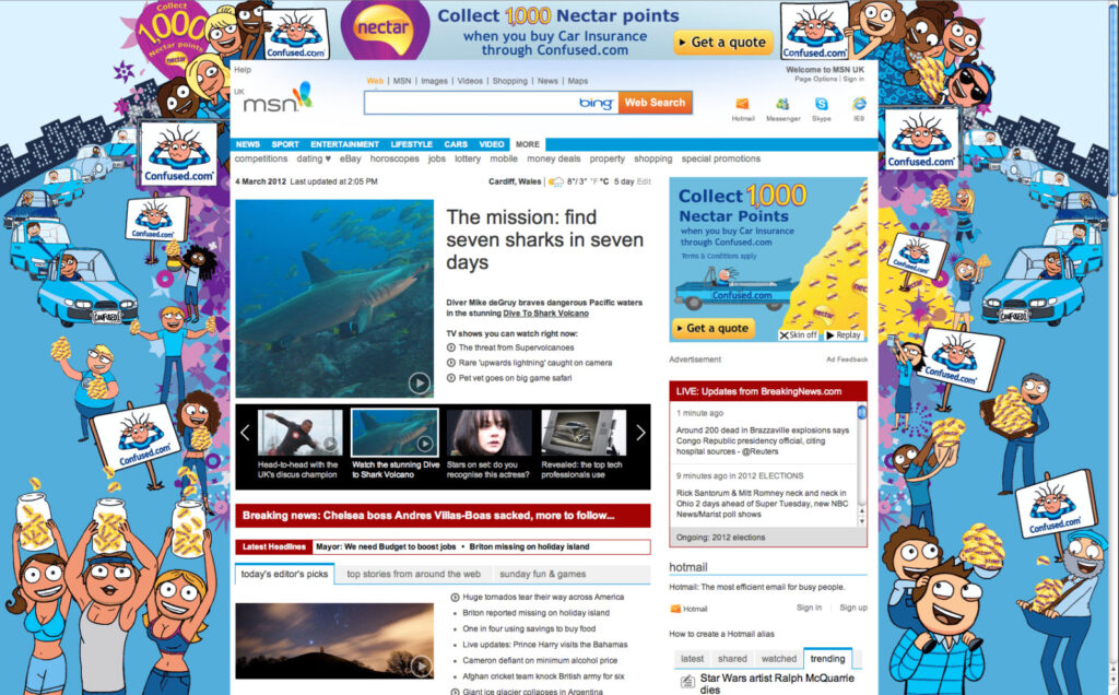
MSN Homepage (Confused.com)

The Challenge:
Confused.com decided to run a homepage takeover on MSN. The first time it was designed completely in house. After a quick brief we produced a couple of sketches based on a concept of collecting Nectar points. Unlike the previous designs we wanted to emphasise cars more to promote car insurance. After all the design needs to push MSN viewers through our Car Insurance quote process. We also wanted to retain the Confused blue colour scheme and not allow the Nectar purple colours to dominate the design.
This wasn’t easy as Nectar are very particular about their brand and the way it sits alongside the Confused branding. The final creative was turned around in less than 4 weeks and i am proud to have lead the design team in one of their highest profile creations.
I came up with the idea of incorporating a coconut shy from the tv adverts. The top banner expands and users play the game as Alan the dog within the page. After the game play the user is taken to the confused.com games page or the car insurance quote process, depending on which message they click on
The banners takes much of the creative from the TV advert but the interactivity and game play were tricky to fit into the banners. We were all revising our Flash skills and getting to grips with Action scripting.
Project overview
Confused.com