Muddy Boots Software

My role:
As head of UX Design at MuddyBoots Software for 3 years I worked on the user interface design for the Product dashboard, email branding and the single sign-on pages.
My core responsibilities:
- User interface design for all applications
- Organising user testing sessions and report recommendations for improvements
- Aligning with product owners to identify key commonalities for the applications
- Creating photoshop mock ups, wireframes and interactive prototype
- Cross‐functional collaboration and creative direction.
- Coordinating with product owners to understand high‐level objectives and collaborate with engineering teams to translate them into engaging user experiences
The challenge
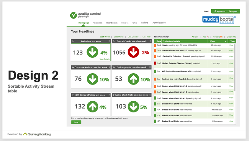
Muddy Boots Quality Control software is a web and mobile-based tool used by Supermarkets, suppliers and manufacturers to schedule and manage product quality.The products previous homepage was a list of assessments available to the user. These reports illustrate the quality of the supply chain and identify problem areas. However the list interface is not very welcoming, the initial screens do not help to ease the user into the product offerings.
I devised a method of consulting with users on what they wanted on a homepage and discussed initial ideas with them face to face rather than second guessing. After consulting with users I found that they often access the same report to find the latest figures before copying and pasting into a spreadsheet to create a graph.
These evolved as the product grew. From simple introduction screens to useful dashboards that gave an all-up view of changes since the previous login.
The process involved observing usage habits either through analytics and shadowing users at their own place of work. Then prioritising the useful and frequently used activities onto a start up screen.

User testing was completed in small groups of users and feedback was received via Intercom.
These screens in the gallery show my ideas for a tiled dashboard that provides users with a clear overview of their data. It enables them to identify problem areas and see changes in values over previous weeks or different providers without running reports. Users are able to view tiles of data, drill down to reports and customise the tiles from a preselected list.
Online styleguide
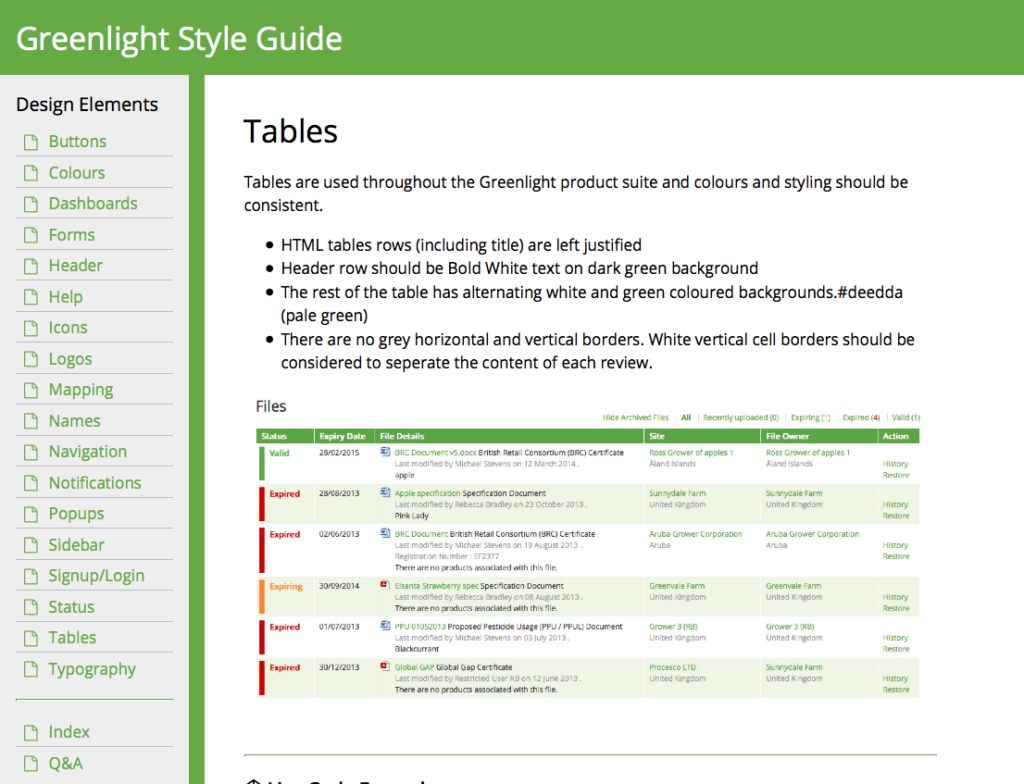
I was responsible for the user interface design for the company’s suite of products. Each product needed a similar look and feel but the individual teams designed what they thought looked best. Creating the style guide online with code snippets ensured members of the separate teams were using the same design, style sheets and html. This kept the look consistent across all the products.
I regularly ran meetings with the stakeholders to review product changes and ensure that the latest style guidelines were being adhered to. This is a constant cycle ensuring that the guide develops as more product features are created. http://greenlightstyleguide.github.io/styleguide/

Project overview
Muddy Boots Software
2013-2014
Creating a design system for MuddyBoots.
Aligning two in house software applications