Weight-Away wireframes and purchase designs

My role:
At Healthspan I lead the Digital Design team, working with Creative Director responsible for the visual identity of the Healthspan e-commerce site and sub brands.
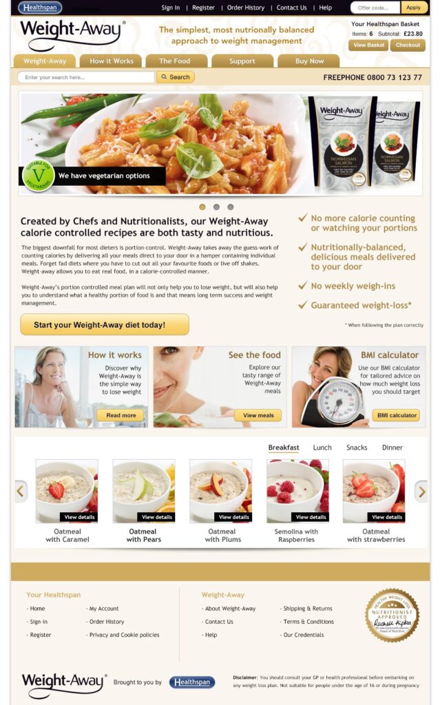
Weight-Away from was a portion-controlled meal plan to encourage weight loss. The website site launched to sell the product, educate customers about healthy eating and support and manage subscriptions.
My responsibilities:
- Design and build html email campaigns, banner animations and web promotions.
- Design of mobile friendly site – initial sketches, usability studies, prototyping.
- Reduced workload by designing templated emails and behavioural triggered emails.
Website:

I designed and created wire-frames for each key page of the site in order to map the customer journeys and determine the key stages of the ordering process. Working alongside the Creative Director, I produced visuals in Photoshop for each of the pages.
Emails:
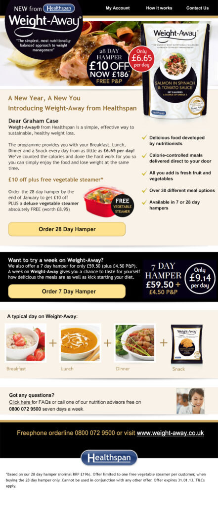
These formed part of a triggered email campaign. When a user signs up to the Weight-Away hampers they automatically receive a series of emails offering information about the product and provided support and advice . Emails were designed to reflect the packet design, company branding and make the food as inviting as possible.

Project overview
Healthspan
2012
Weight-Away branding for homepage and email campaign. This was a subscription based meal programme from Healthspan which was delivered in a hamper.